Has this ever happened to you?I saw an ad in my Facebook feed for a software app that could help me make neat little video animations. I clicked on it to learn more. I was directed to a website with a suite of software apps, but none were specific to the one I saw in the ad. Overwhelmed with info and unsure of where to find information on the product I was interested in, I left.If you’re highlighting a product or service (a good best practice when building an ad), directing traffic to your business’ homepage can be overwhelming and confusing. It would be like telling customers your store is in the mall without mentioning the specific location within the maze of shops. Anyone who actually drove to the mall has the potential to get very distracted without direction - they might spend all of their money on a massage chair in Brookstone, or eat themselves sick on Cinnabons - and never make it to your store.On your website, there are no rival businesses to distract visitors, but the risk is the same. The digital maze of your website is likely to encourage abandonment - it’s too easy to click out (as I did) and go back to scrolling Facebook.So, what’s the solution? In this age of digital marketing, creating a landing page to highlight a specific product or service is the perfect stepping stone in an ad-to-purchase conversion funnel. When directing traffic from a digital ad, whether from Google, Facebook, a banner bar, etc, sending clickers to a product-specific landing page is far more likely to convert because it’s the perfect medium to offer more information as well as a clear next step. Your landing page can display CTAs to purchase, download, or “get started,” leading the visitor on a clear path through your conversion funnel.
Sending clickers to a product-specific landing page is far more likely to convert...
With the tips outlined in this article, learn how to optimize your ad-to-landing page experience to attract the right visitors (as opposed to the most visitors), and reduce bounces to achieve the maximum customer conversions.
Target Your Ad to a Specific Audience
The first rule of marketing is: know your audience. It’s tempting to try and appeal to the masses, but understanding the niche following that values and appreciates your brand will allow you to tailor your marketing to be more effective. It’s easier said than done, but here are a few tools most businesses have at their disposal to dig deeper into learning who their audience really is.Use analytic data already available to you. A surprising number of analytical tools already lay at your fingertips. Your social media profiles offer analytics about those following your profile. Google analytics is another tool offering comprehensive data about visitors on your website or any other site you integrate with it. These tools can offer key data points like average age, gender, and geographic location - helpful when tailoring marketing copy.

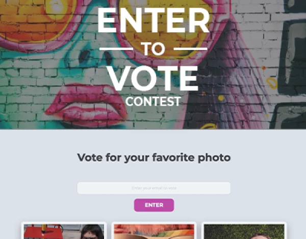
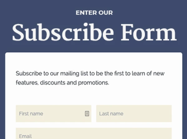
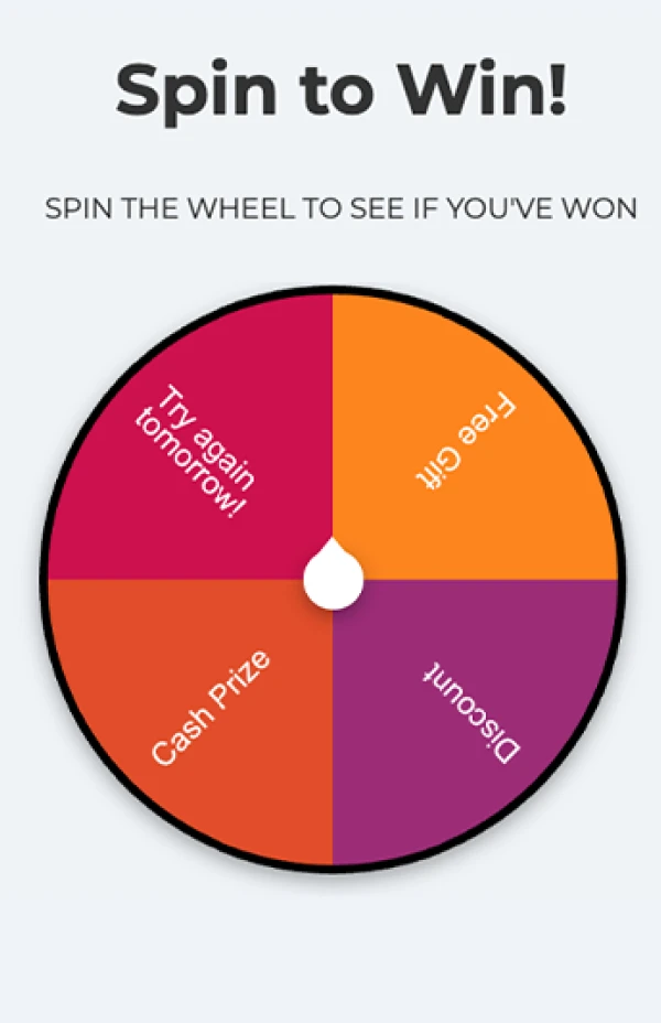
Poll previous or current customers. Polls and surveys are valuable tools that give you the flexibility to ask questions like, “How did you hear about us?” or “How many people are in your household?”Polls and surveys can give you great insight, but in this data-driven world, people aren’t always so keen to give up their deets. Incentivize engagement with a contest, giveaway, or free download and integrate the survey questions within the entry form.

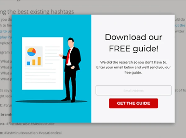
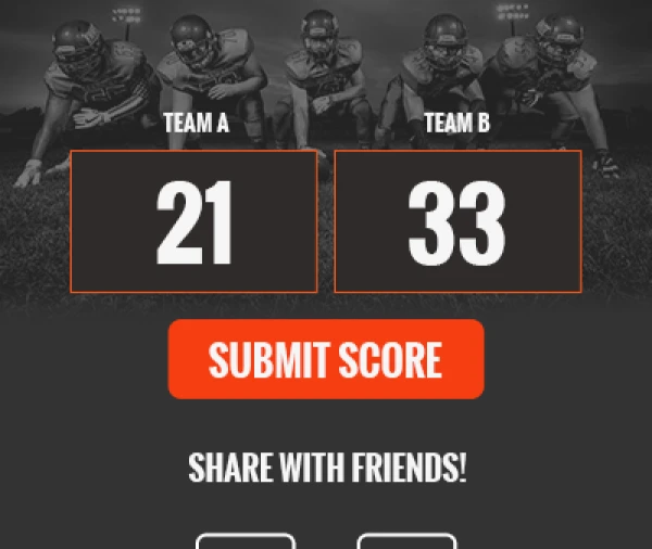
ShortStack's Downloadable Content templateView and Create Your OwnYou can also poll current customers by adding a simple question in a checkout form.
Your Landing Page and Ad Should Speak the Same Language
Message match. Once you’ve targeted an audience, use keywords, imagery and language in your landing page similar to what you used in your ad. This practice of message matching is important for brand continuity and trustworthiness.Don’t make click bait. Just as it’s important to appeal to a specific audience, it’s important that the clicks you get are genuine. It’s frustrating for readers to see “Learn this one simple trick celebrities use to lose weight fast,” only to click on the ad and find a landing page selling an expensive diet shake detox program lasting 30 days - not exactly “one simple trick” is it? Needless to say, in this scenario, most ad clickers would probably bail.On the other hand, had the ad described the product a bit more *ahem* realistically, the landing page could potentially see a much higher conversion. For example, “Click here to learn about the detox plan celebrities are swearing by.” The keyword “plan” (as opposed to “simple trick”) draws the attention of those willing to invest more time and money into a weight loss regimen. It may attract less clicks overall, but those that do click are more likely to convert.
Design Tips for Ad Design
Designing an ad is trickier than it sounds. You’re limited on space, text and how much imagery you can use to capture the eye. Here are a few tips to help you build effective ads.Target your audience. To reiterate my earlier point - pick one clear message. Your product or service won’t appeal to everyone. Think of the problem your business solves for others and create an engaging plea based on that.Try and stick to the 20% rule. Whether your ad will be visible on Facebook, in a banner bar, as a popup, or on Google, you’ll only have the reader’s attention for a few seconds. In this age of ever-shortening attention spans, too much text can overwhelm the average scroller. Use attention-grabbing images and keep text to a minimum to clarify and drive home your message. We found some 20% text templates you can download for free.An incentive never hurt. There’s no shame in offering a coupon or discount. In fact 93% of shoppers use coupons and discounts, so it’s obviously an effective strategy. If you’re opting to dish-out a discount, don’t keep it a secret. Announce it upfront in your ad to incentivize more clicks.

Design Tips for Landing Page Design
Information is power. The more info a consumer has when buying a product, the more likely they are to pull the trigger. Try to answer important questions on your landing page, include short descriptions when displaying products, or add pop-outs if points need elaborating. Provide the reader with everything they need to be able to make a purchase decision (or at least to continue on to the next stage of your funnel), including examples, gifs, or even a short video.Start with a professionally designed template. Even if you’re not a graphic designer, you can still create something visually stunning that coincides with your brand. Services like ShortStack offer dozens of pre-designed, yet completely customizable templates that help you take the guesswork out of building a landing page design. After all, a blank canvas can be daunting to anyone, even the most professional designer. Not to mention, pre-designed templates can save you loads of time.

ShortStack's Landing Page templateAdd some customer reviews. The most awe-inspiring copy and art can’t measure up to the marketing power of a review. Much like word-of-mouth marketing, customer reviews create a level of trust integral to customer conversion, so add one or two to your landing page.
A/B Test
A/B testing (also known as split testing) is when you create two versions of a landing page, email, ad, etc. to see which one performs better.
A/B testing is commonly used to test copy, imagery, and design. A/B tests can finally help you settle design strategy disputes without the use of speculation.
When your fellow marketing colleagues believe a button CTA of “Download Now and Get Rich” trumps your idea of “Learn to Build Wealth with this Guide,” an A/B test will ultimately tell you which attracted the most downloads.
It may be (and usually is) completely surprising what your audience responds to.Learning the secrets of what converts best will be unique to every business.
A strategic and well-thought-out ad coupled with a professionally designed landing page can certainly help put your leads on the right path to customer conversion. Be sure to continually test, tweak, and try new things!
Create your first contest now
Get Started Today. It’s free and we don’t need your credit card.
About the author
Jessica Miller-McNatt has been with ShortStack for over a decade and has served in every role from Marketing Team Lead to Customer Success. Her journey in martech continues to fuel her fascination for what drives growth. Jessica's favorite weekends are spent in the North Georgia mountains, chasing waterfalls and exploring with her family.
Recent posts
Go back to blogGet marketing tips straight to your inbox
Launch an irresistible giveaway. Get started for free.
Join 630.000+ marketers that are boosting engagement and sales.
