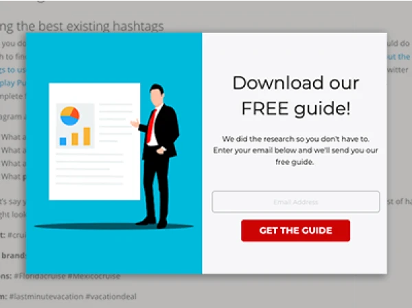
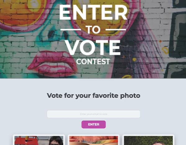
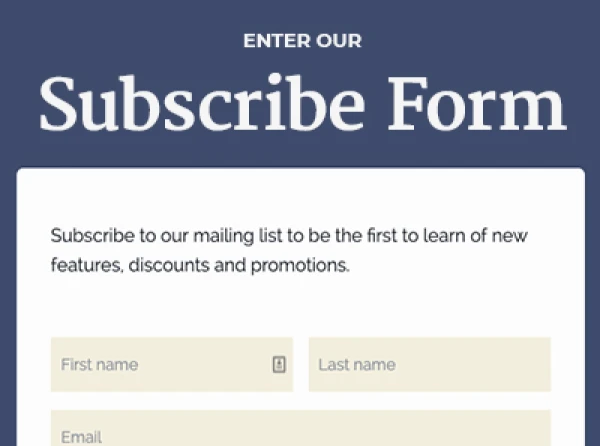
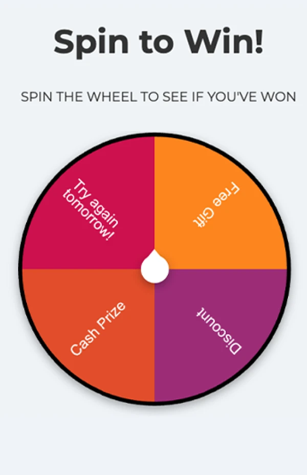
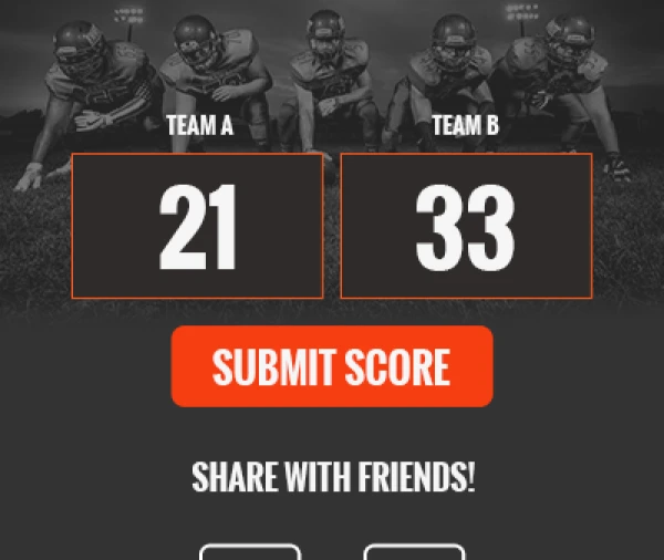
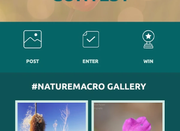
When a person clicks on your Facebook ad, you have 8 seconds to grab your visitor’s attention and get them to convert, i.e., purchase your product/service, download your resource, register for your webinar, make an appointment, etc.
This means the design and copy on the landing page you link to have to be spot on.
Over the years, my team at ShortStack and I have tested many types of landing pages for the Facebook ads we’ve run.
We’ve learned a lot about the types of landing pages that convert.
Here are the best tips we’ve discovered to dramatically improve the conversions of your Facebook ads:
1. Know when to use lots of copy (and when to use a little)
Depending on what your goals are for your brand’s Facebook ads campaign — and what your definition of a conversion is — you will either use a short- or long-copy landing page.
Short copy is often best reserved for when your goals are immediate — like you want to capture email addresses so you can email subscribers access to an exclusive, limited- time-only sale, or you want to get sign ups for a webinar you’re having soon.
Landing pages with longer, more detailed copy are best used when you have a more long-term goal.
Let’s say your goal is to create awareness for a new product or to educate your audience about a problem and a solution your brand provides.
In these cases, long-copy landing pages can help your brand establish trust and credibility with those who click on your ad.
One warning: Don’t expect to see too many hard conversions immediately.
When you’re playing the long game, conversions often come in later down the road. Instead, look at time on page as a success metric.If folks are landing on your page and not bouncing, this is a good sign your landing page is doing its job well.
2. Use visual elements
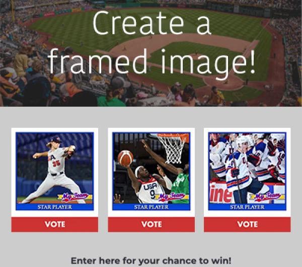
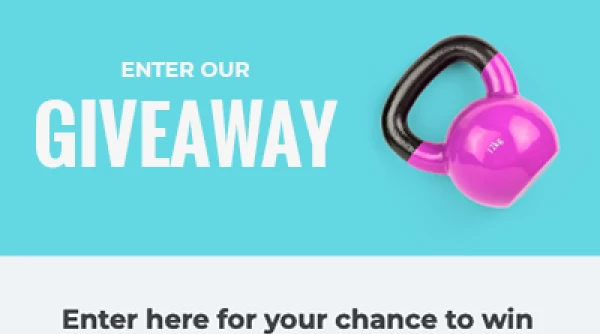
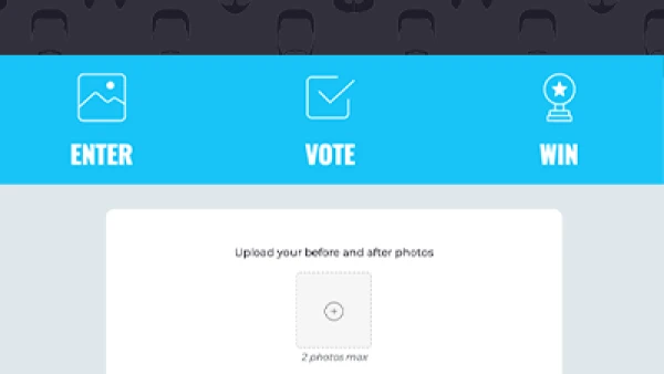
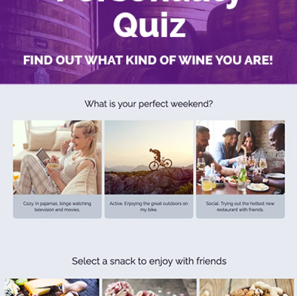
There are a number of reasons it’s a good idea to use visual elements on your Facebook ad’s landing page.First, our brains consume images and their meanings more quickly than they do plain text.
This makes sense as 50 percent of the brain is involved in visual processing and 65 percent of people are visual learners.
Second, visual elements allow you to design a landing page that flows nicely.
You can use graphics and images to break up your landing page so that its content is easily digestible.What you don’t want is for ad’s clickers to be faced with intimidating, dense blocks of texts — this will surely lead to high bounce rates and low conversions.
Last, visuals have the power to deliver emotional cues and messages to your landing page visitors, without the use of additional copy.For example, if you a have bold red button or arrow, this sends a strong signal to visitors that action should be taken quickly.
Whereas, if your visuals are primarily blue, it’s subconscious language is more friendly and calming.
3. Follow the KISS principle
“Keep It Simple Stupid!” You’ve heard the phrase. And getting complicated is a mistake too many brands make.
They have a sharp message for their Facebook ad; then they complicate their message on their ad’s landing page.
How? They add social icons, unnecessary links and tabs, drop-down menus, etc.
The trouble is, all of these added landing page “features” hurt conversion rates. Any information or clickable link or button that does not support the goal of your landing page should be removed.
Too many things to click on will only distract your landing page’s visitors from accomplishing the task you have set forth for them.To drive this point home, in a SlideShare titled “I Give a S4!$ About Your Conversion Rates” from Oli Gardner of Unbounce, check out the example of two similar landing pages.
The only difference is one page has outbound links in its footer.
By removing the links, it improved the landing page’s conversion rate by a whopping 42 percent.
4. Focus your landing page copy on benefits
You may have heard this saying before: Benefits sell, features don’t. I’ve found that this tip, above all, makes the biggest difference in seeing more conversions from my company’s Facebook ads.
When our landing page’s headline has been, “Use ShortStack to Build Powerful Social Campaigns,” we always get poor performance compared to when we use this headline, “Engage Your Customers and Collect Leads with ShortStack.”
See how the latter headline focuses on the benefits our platform provides, instead of just stating what we are.
The point is: To make a greater impact with your landing page’s copy, and to drive up conversion rates, focus your copy on the solution your product and/or service provides — or the incentive your brand is offering.
If you keep your copy about your visitors and their wants and needs, you’ll always have more success.
Readers, what tips do you have for creating high-converting Facebook ad landing pages?
Please share your input, or questions, with me below.
P.S. You can use ShortStack to create your Facebook ads' landing pages. Get started for free -- we won't even ask for your credit card.
About the author
Dana Sullivan Kilroy is a communications professional with more than 20 years of experience delivering compelling content. Her work has appeared in national, award-winning publications and sites, including: The New York Times, The Los Angeles Times, The Wall Street Journal, USA Today, and Fast Company, Inc.
Recent posts
Go back to blogGet marketing tips straight to your inbox
Launch an irresistible giveaway. Get started for free.
Join 630.000+ marketers that are boosting engagement and sales.
