Ever wonder what designers are using to make the landing pages and websites they design wow-worthy? I do, too. Try as I may, I never have the right touch. That’s why I asked our graphic design magician what she thinks anyone can do to take their online marketing campaigns to the next level. She gave me the following four easy tricks.
Give content room to breathe with padding and margins
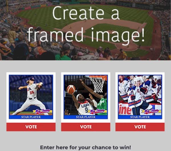
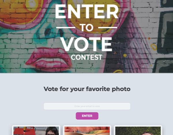
You might think adding margins or padding around content on your campaign -- also known as whitespace – is a waste of valuable screen real estate. However, allowing for space between elements on your campaign is essential for effectively communicating your message. Adding whitespace makes text on your landing page easier to read. More importantly, your calls to action are much clearer if your landing page isn’t filled to the brim with content.

Increase the white space in your landing pages to make important content stand out View and Create Your OwnLooking for a good rule of thumb when adding margins to your campaign? Try using 30px margins between pieces of content to start; however, sometimes more space is needed, so don’t be afraid to try larger margins.
Visually organize information with color blocking
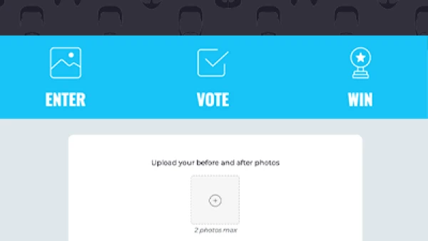
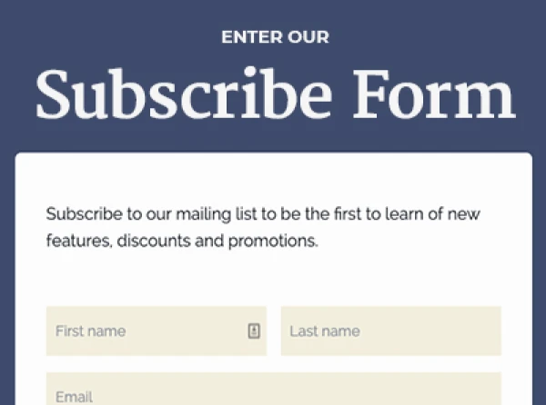
Color blocking is an easy way to visually organize the information on your campaign. The concept is pretty simple; however, much like adding whitespace, the impact is dramatic. Just use different background colors to break content into different sections or highlight important content. Color blocking gives the viewer subtle cues about what information is important while giving all of the content an organized “place to live” on your landing page.

Color blocking helps visually organize your information.
Make important content stand out with different font sizes
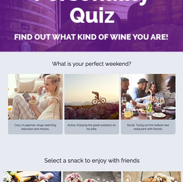
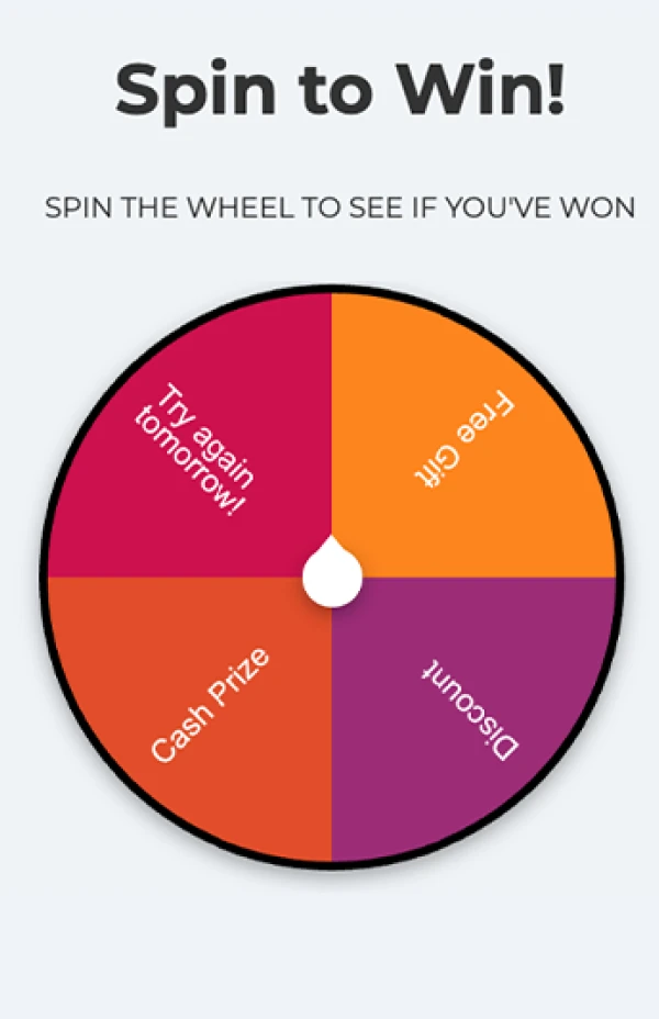
Big blocks of text are intimidating. Use a variety of font sizes to direct visitors to the most important information quickly. The bigger the font, the more important the message. Most landing page tools give you the option to implement different header stylings, so use them! An effective font size hierarchy will help reduce bounce rates due to the ease with which visitors will be able to decipher what your landing page is all about.

Use headings to call out the important points of your textReminder: Make sure the text you use in your campaign looks good on all devices, including mobile.
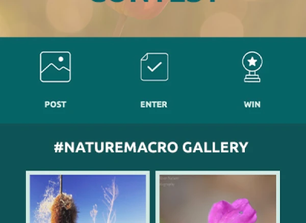
Increase clarity by breaking up the steps you want visitors to take
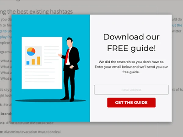
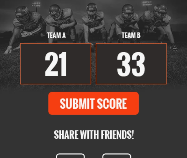
Are you running a contest where entrants must complete several steps to enter? Or perhaps you want to inform participants about the timeframe for each portion of a contest. Whatever the reason, if you have a number of important steps, then break them up into sections. Organize the steps into distinct columns and label each step clearly. You could even use icons to illustrate simple ideas.

Visually break up steps to make them easily scannedVoila! Four easy tips to add magic to your landing pages. Now, get out and practice what you learned.
Want more design tips and ideas? Check out the articles in our Design series.
Have any questions on styling your campaign? Send us a message: theteam@shortstacklab.com.
About the author
Jane has over a decade of martech experience, with an emphasis in content marketing, UX, and customer success. Her combined skillset and years of hands-on experience make her a valuable player in the industry. In her free time, Jane loves quiet family dinners at home and a good book.
Recent posts
Go back to blogGet marketing tips straight to your inbox
Launch an irresistible giveaway. Get started for free.
Join 630.000+ marketers that are boosting engagement and sales.
