The first step to growing email lists? Sharing forms people are willing to fill out!
You’ve got a website, and you’re all over social media, but how do you turn all the people who visit your channels into leads? Lead generation and email signup forms are a must for businesses operating online. Placing forms strategically on your sites and social channels gives you the opportunity to capture leads, but you don’t have to settle for boring forms that offer little incentive in exchange for the consumer information you're after.Let’s look at how you can make sure that your forms are being utilized correctly, as well as some creative strategies to improve your capture rate.
Best Practices for creating forms
1. Don’t ask for sensitive information
The objective of a form is to collect information, but there is definitely a point where you can go too far. When you’re designing your form and determining the information you want to collect, never ask for:
- Personal information belonging to minors
- Social Security numbers
- Financial account numbers
- Credit card numbers
- Login information
Caveat: These rules apply to entry forms, including contest entries and newsletter signups. Obviously, if you are creating a form for account creation, or for certain verification purposes, there will be times where it is appropriate to ask for a password or social security number. In essence, you should only include these types of fields if they are absolutely necessary, and for valid and legal purposes.
2. Keep fields to a minimum
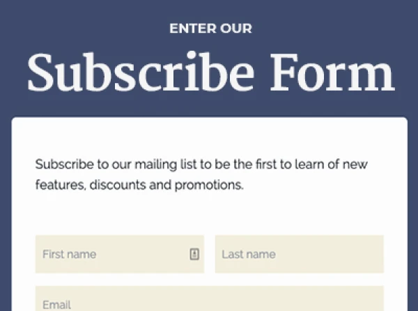
Less is more when it comes to form fields and this is hardly surprising. If you search for articles on "best practices for creating forms," chances are you’ll see "Ask for as little as possible" as tip #1.
Expedia lost $12 million by having one too many fields
For example, there's the company that increased their conversions by 120 percent when they reduced their form fields from 11 to 4. And then there’s the test where a form with nine fields was outperformed by a form with five fields by 34 percent. And who could forget how Expedia lost $12 million by having one too many fields? All this doesn’t mean you should only ask for an email address, it just means that for every field you add to a form, you should ask yourself, “Do I need this information so I can follow up?”
3. Design matters
This concept is often an overlooked one, but the flow and design of your form can affect its conversion rate. In general, it’s a good practice to design your forms along consistent branding guidelines, particularly if these forms are going to reside on your website. There are also a few tips that you should follow to give your forms an ideal flow:
- Form fields should have a top left alignment, making it easier for a user’s eyes to go from step to step.

- Form fields should be single file

- Indicate which fields are required and which are optional -- unless all fields are required. An asterisk is typically used to indicate required fields, but consider adding “(optional)” at the end of your optional fields.

- Use radio fields instead of drop-down fields. A drop-down field requires additional clicks, more dexterous maneuvering, and is more difficult to use on a mobile device. Radio fields, on the other hand, make all of your options more visible and comprehensive.

4. Forms must be mobile friendly
Forms should be mobile responsive, designed for fingers as much as for mouse cursors. Why? Consider the uptick in our reliance on mobile devices: In 2017, 71 percent of minutes spent online (in the U.S.) have been on mobile devices. Online use has been trending more towards mobile devices for years, so what key differences will help users fill out your form on a mobile device. The first, of course, is simply using a program that is mobile responsive.

Many of the other considerations have been covered above. Single-file fields help users move from field to field using their fingers, particularly in a vertical scrolling environment. You also want to avoid using segmented fields, such as using three fields to collect a phone number.

5. List the easiest fields first
Think of this like dipping your toes in the water before jumping in. When you place your easy fields, such as “name” toward the top, you are not asking an entrant to think too much.The idea is simply to get people started with your form, creating a level of commitment. Once they've started, they're more likely to fill out the field at the bottom of the form asking for their testimonial, but don’t forget about tip #2 above (hint: make sure you're asking for info you really need!).
6. Use validation prompts to assist people
There are few things more frustrating than filling out a form, hitting submit, then receiving an error. So when people forget to enter ".com” at the end of their email address, make sure the error message they receive effectively communicates what they need to do in order to submit their entry.

Creative ideas to increase form conversions
1. Give people an incentive
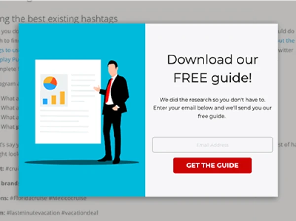
How do you encourage people to willingly offer their contact information? The go-to answer is to entice people with promises of deals and offers. This approach is certainly better than not offering an incentive, but if you really want to increase your opt-ins, consider offering an immediate benefit.

Coupons and Discounts
Offering a discount has a couple of benefits. First, it gives consumers an immediate reason to share their email address. It also encourages spending, leading to immediate returns on your efforts.

ShortStack's Coupon Download template View and Create Your Own
Giveaways
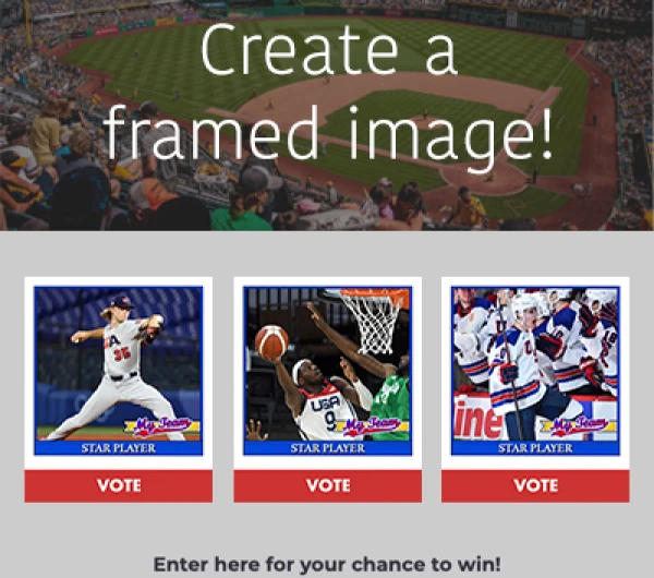
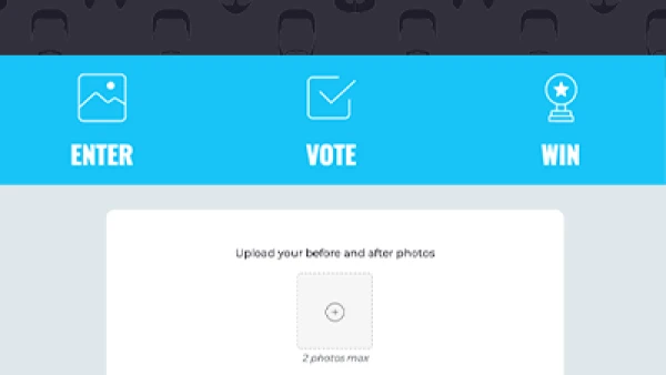
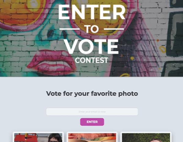
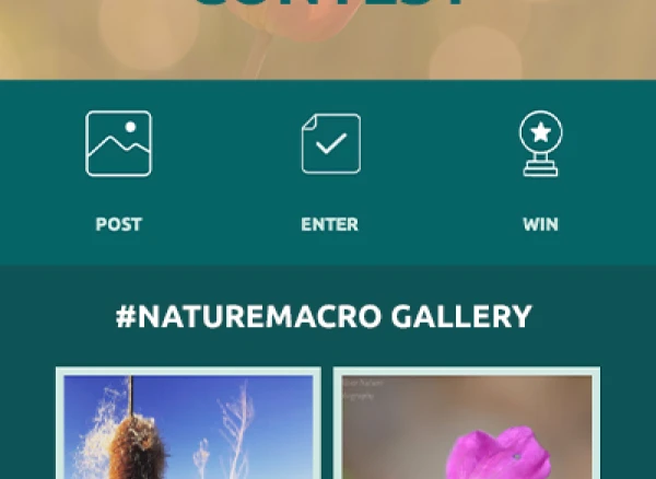
Offering a prize will typically get you the most form submissions, and hosting a giveaway is an ideal way to increase awareness around your products and services. There are a variety of types of giveaways you can run to keep your promotions fresh -- from your standard enter-to-win giveaways, to more unique giveaways like vote-to-enter, guess-the-score for sporting events, pick your prize, and multi-day giveaways.

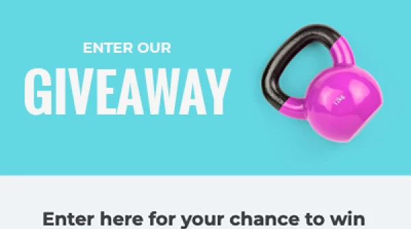
A handful of ShortStack's giveaway templates View and Create Your Own Because there is an element of chance involved, you can also encourage certain behaviors that will offer additional benefits. You can offer people additional entries for filling out certain parts of your form. If you feel the need to capture additional information, but you’re wary of making your form too burdensome, this is a valid compromise that will allow you to ask for more, but lessen abandonment due to the incentive attached. You can also offer additional entries to people who share your giveaway with their friends, which will help you gain exposure on social media sites.

ShortStack's Refer-a-Friend template View and Create Your Own
2. Turn your form into a quiz or game
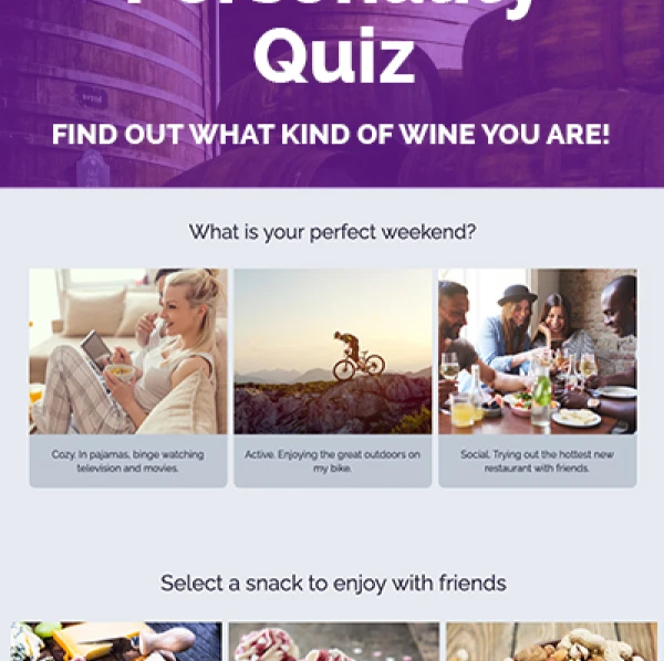
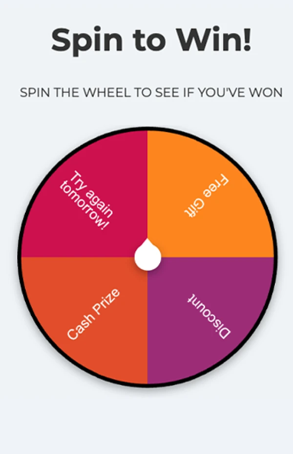
Using rewards is not the only way to encourage form participation. Consumers like to "play" with brands they follow. One way to engage with consumers is with quizzes and games. Quizzes can help to educate consumers about your products and services, so quizzes are ideal whenever you are trying to get the word out about a new product, service or location. Buzzfeed-style personality quizzes allow you to propose a series of questions, which will lead to a unique outcome based on the participants answers. This accomplishes two objectives. The first is you can educate participants by structuring your questions around your offerings. The second is that you will gain valuable feedback from users by evaluating the answers they gave.

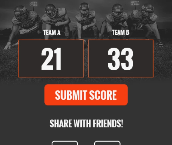
ShortStack's Personality Quiz template View and Create Your Own Games are more often going to be utilized around events. For instance, if your local sports team has a game coming up, you can run a Guess-the-Score campaign. Or you might run a story contest around Mother’s Day. There are a variety of games and contests you can run during moments where you can identify with your consumers on topics that are already at the top of their mind.

ShortStack's Guess the Score template View and Create Your Own
3. Tie into social media
For most businesses, building email lists will be the most important initiative in online marketing. Email marketing still yields better click-through rates and conversions than any social media site, and that's unlikely to change any time soon.This doesn’t mean you should neglect social media, which may not have immediate conversion rates, but helps to create brand awareness and loyalty. Why not use your forms and email marketing campaigns to draw more attention to your social profiles? After someone fills out a form, you can remind them to follow your social media pages, and if you’re running a contest or giveaway, you can even encourage them to share your promotion to their social media pages by offering additional entries. As mentioned above, this will help you gain exposure to your customers' friends and followers.Lastly, don’t forget to include links to your social media pages in your email campaigns, whether they be autoresponders or scheduled emails. There you have it: Six ways to ensure your forms are optimized, and three creative strategies to help take your capture rate to the next level.
About the author
Brent Danberg is ShortStack’s VP of Business Strategy. Over the years, he has advised more than 1000 businesses and agencies, helping them achieve their digital marketing goals.
Recent posts
Go back to blogGet marketing tips straight to your inbox
Launch an irresistible giveaway. Get started for free.
Join 630.000+ marketers that are boosting engagement and sales.
